AppMasking The Windows Start Menu

A completely not-crap way of cleaning up the Windows Start Menu - without breaking stuff
Intro
Back again banting on about the Windows Start Menu (surprised?). I am hoping this is one of those James Rankin “final say” style blog posts where I can put this bad boy to bed because I am pretty sure I have my silver bullet to providing a nice start menu environment consistently and efficiently. Just as I was going to post this write-up, the man himself decided to post his own guide on how to achieve the same thing, so I am going to restrict this post to focus on the default Start Menu.
I also had a conversation recently with CTP legend Dave Brett who was discussing how he and his team had been able to completely change their whole strategy of application and desktop publishing based on App Masking everything that turned up….which I tend to now agree with 100% and initially got me thinking about the below…
Traditionally Handling the Start Menu Fun
For years I have been hunting down and ranting on about all sorts of different ways to handle the Start Menu, from Tile management to custom toolbars, WEM and simply stripping it all out:
- Citrix Blog Series:
- Kindon rant series:
I have a process that I use consistently with success and have been more than happy with the results, however it required a few moving parts to achieve my simple requirements as outlined below:
- Remove user permissions from the unwanted junk in the “common start menu” directories. What they can’t read they can’t see, and thus we non-intrusively remove junk the users start menu. Typically, I have driven this via Group Policy
- Remove junk from the user profile once created (sourced from the default user profile). This has typically been handled by the likes of Citrix Workspace Environment Management or Group Policy Preferences
- Remove the WinX menu’s that are not relevant for users in a shared hosted environment, once again typically handled by WEM or GPP
- A custom Start Layout to handle the user experience in relation to tiles as a baseline and sometimes for ongoing control
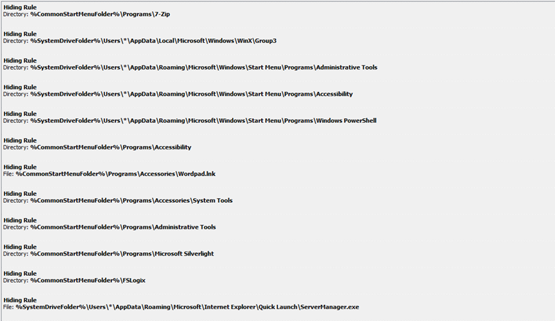
Results are grand (and by grand I mean simple) but it’s complex to achieve what should be simple, and admittedly some components are intrusive and there is no easy way to come back from the changes that get made. Enter FSLogix AppMasking to once again simply my life. Using AppMasking rules, we can create the perfect junk-free Start Menu with simplicity and ease, also allowing for an immediate rollback of any changes should things go pear-shaped, reverting the user profile and OS itself to an unaltered state in no time. Using AppMasking, we can mask the following
Folders or Files in the Common Start Menu Location C:\ProgramData\Microsoft\Windows\Start Menu\Programs\WhateverDirectoryOrFile
Folders or Files within the user profile C:\Users\*\AppData\Roaming\Microsoft\Windows\Start Menu\Programs\WhateverDirectoryOrFile
The right-click WinX folders C:\Users\*\AppData\Local\Microsoft\Windows\WinX\Group3
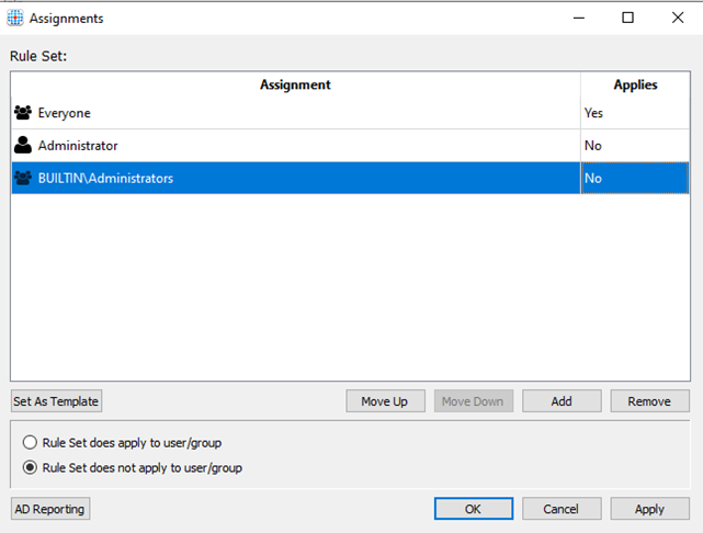
There are a few simple rules to abide by. In your AppMasking profile, make sure you exclude your local administrator or equivalent account, as well as the local Administrators group. This will allow you to view the world as an administrator should, with no customisations made to the OS or your operating environment.
Moving forward, when applications are installed on the image, you have two things to think about:
- What am I installing that is going to dump crud into the Common Start Menu, and do I need to update my baseline Start Menu masking file OR,
- Am I going to mask all my new installations onto my server (James nods) allowing for new things to show up in the start menu in the correct location ONLY if the user has access to see them? Most of the time when you mask applications, FSLogix picks up that there is a new shortcut put into the common Start Menu location, so you are already well on your way.
The one scenario where you may be required to think about both of the above at the same time will be for the situation where you install an application which decides to not only publish the simple executable into the Start Menu, but also help files, additional tools, loads of useless crud that simply put no one in there right mind what’s to see (you know who you are vendors). In this scenario you may choose to add some additional entries into your default start menu App Masking definition, to cater for when users that should see your new app log on, they only see what is of use, rather than a world of clutter
Masking in Action
Below I have a Windows Server 2019 environment with a load of packages pulled down to mirror a standard “typical” deployment I see in the field, the usual suspects are deployed – Microsoft Office 365 ProPlus, Chrome, Adobe Reader, FSlogix Apps, Citrix Components etc (I even included Java to prove a point)
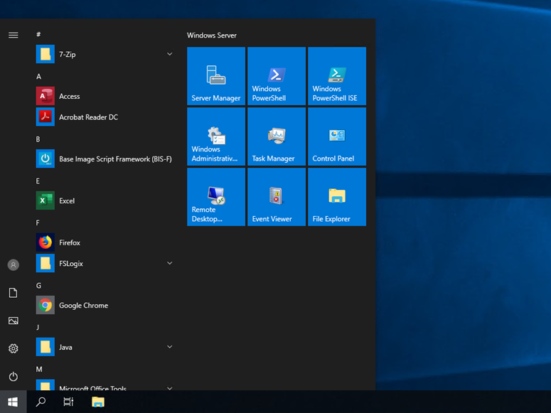
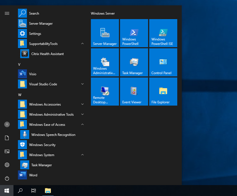
My test user az.jkindon1 is the chosen user to be punished for this small demo, his first-time logon with no controls, no policies etc results in the below experience:
We have this:
And this:
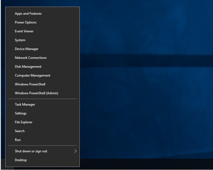
And even the default context is cluttered with this:
There is so much in the Start-Menu I had to take three screen dumps. Yes, there are controls to hide a lot of this stuff as you need (admin tools etc) but the point of this post is to prove simplicity with App Masking and minimal effort.
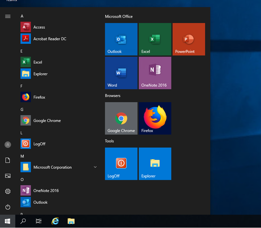
Now a nice little Custom Start Layout handled to get rid of the junk, my nice shiny Start Menu AppMasking files in place and a new user now gets a menu that is actually relevant to them:
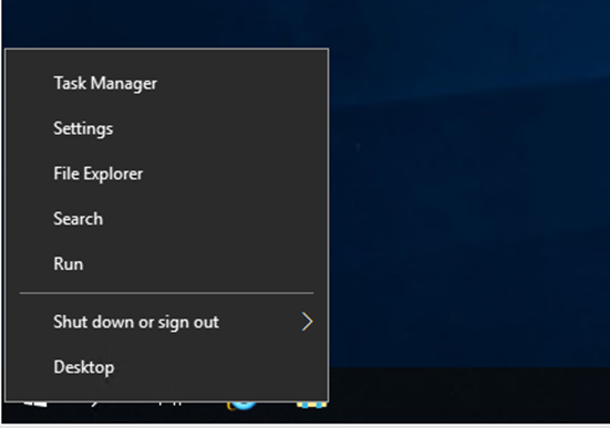
Even the right-click context menu now represents entries that will most probably be of relevance to their everyday life
Summary
AppMasking is a game-changer for so many different reasons, the more I talk to customers about problems or challenges with image management, the more I find this solution has an answer, and the more the community gets involved, the more cool things are being found and different challenges tackled.
I highly recommend going and reading through James Rankins article and watch his video, as whilst I have laid the basic foundations for getting a starting point, he will take you through how to move it on from here on out with additional apps being masked, and creating a dynamically changing Start Menu environment.
Much Kudos to Dave Brett for getting the old brain synapses firing once again in this space
